

Last updated November 19, 2026
High-performing email design balances aesthetic appeal with psychological conversion architecture. This list covers essential layouts and strategies for bridging the gap between visual hierarchy and your CRM to ensure every open moves a lead closer to a sale.
1. Leverage a mobile-first responsive design to capture the 81% of users opening on phones.
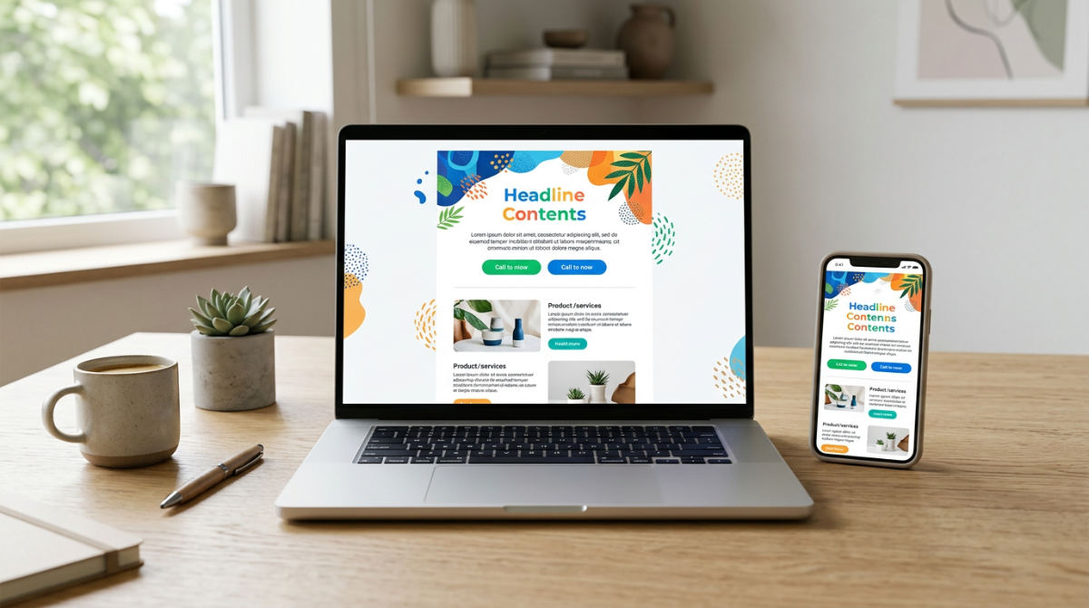
Mobile-first design is the mandatory approach for modern layouts. It is not optional. The majority of your audience interacts with your brand on handheld screens. According to industry data from Emercury, a significant majority of all emails are now opened on mobile devices. If your layout isn’t optimized for a vertical screen, you are essentially ignored.
Users decide to delete or read an email within just 3 seconds of opening. Think about that. Your primary value proposition must be visible immediately without scrolling.
To combat this tiny window, adopt single-column layouts. These eliminate horizontal scrolling entirely. Small buttons are the enemy of conversion on a touchscreen. Ensure all call-to-action elements are large enough for thumb-driven navigation. When you move from desktop-heavy designs to mobile-optimized templates, engagement typically increases. Our Marketing Automation tools allow you to build responsive layouts that look sharp on any device. Your message will land perfectly. Use them.
Source: Emercury
2. Use an E-commerce Product Showcase template to guide subscribers through psychological pathways.

An E-commerce Product Showcase template uses a strategic visual hierarchy. It mirrors natural scrolling behavior. This leads the eye toward a purchase. You want to lead the eye from a compelling header image down through the benefits and finally to the purchase button. Treat high-quality imagery as conversion architecture. It is not just decoration. Every photo must move the customer closer to the checkout.
Color psychology also plays a massive role in building immediate recognition. Consistent brand colors establish trust. Trust is a prerequisite for any transaction. In our CRM ecosystem, you don’t just send these emails in a vacuum. Use our visual node-based workflow builder. It triggers specific product showcase designs based on exactly where a lead sits in your sales pipeline. This ensures the design the customer sees matches their current intent.
Source: Emercury
3. Optimize for Dark Mode to ensure readability across all user system preferences.
Dark Mode is a system setting that designers must optimize for. It ensures text legibility and brand consistency. If your design isn’t prepared for color inversion, your beautiful template can quickly become unreadable. It looks broken. One of the most common mistakes is using logos with solid white backgrounds. When the user’s phone flips the theme to dark, that logo appears as an unsightly white box. Always use transparent background PNGs.
Check your contrast. You must verify that your text-to-background contrast remains standards-compliant when colors invert. If you are using advanced custom coding, utilize specific CSS media queries. This controls exactly how your brand colors behave in dark settings. Neglecting this leads to a poor user experience. Managing these technical hurdles is easier when you consolidate your tools. Many businesses find that choosing the best email marketing platforms that integrate with Typeform helps them maintain a consistent look.
Source: Emercury
4. Deploy magazine-inspired layouts to stand out in crowded retail inboxes.
In a sea of generic promotional blasts, magazine-inspired layouts offer a premium feel. They grab attention. These designs combine bold, editorial-style typography with high-quality photography. They create a "lookbook" experience. This approach works for retail and lifestyle brands where the aesthetic is part of the value proposition. By using grid-based structures, you can display multiple product categories without creating visual clutter.
Incorporate high-contrast "sale" or "CTA" elements that pop against the more muted editorial content. This creates a clear path to action while maintaining a sophisticated brand image. If you find the design process daunting, consider how modern tools are evolving. Much like an AI website builder that designs itself simplifies creation, our platform handles the alignment and responsiveness. Focus on the creative direction. Let the system ensure your magazine-style emails are functional.
Source: Pinterest
5. Create a SaaS Feature Announcement template focusing on benefit-driven visuals.
For software and service providers, the goal of an email is often to explain complex features quickly. A high-converting SaaS template uses strategic white space. It separates technical details. This makes the content "snackable" and easier to digest. Design for progressive enhancement. The message must remain functional and clear even if the user has images blocked by their email client.
Avoid "choice paralysis." Stick to a single, primary call-to-action. If you want them to try a new tool or read a changelog, give them one clear path. Benefit-driven visuals, such as icons or simplified UI screenshots, help the user visualize the value immediately. We advocate for a unified approach. Rather than having your feature announcements disconnected from your user data, our all-in-one email marketing system keeps your designs synced with your CRM. This allows for precise targeting.
Source: Emercury
6. Implement interactive email elements to boost engagement rates.
Interactive email elements increase engagement by allowing subscribers to click, swipe, or engage with content directly inside their inbox. Elements like hover effects, image carousels, or simple accordion menus can significantly increase the time a subscriber spends inside your email. By letting users engage without leaving their inbox, you reduce friction. You build a more immersive brand experience.
Be careful. Always include reliable fallback designs for older email clients. Certain versions of Outlook may not support these advanced features.
Focus on one interactive element per campaign. This keeps the user targeted on the main goal. Too many moving parts can distract from the call to action. While many tools struggle with these modern requirements, our platform is built for the future. Because we provide a unified AI operating system, your interactive emails are just one part of a larger, automated funnel. When a user interacts with a carousel, that data immediately triggers a follow-up action in the CRM.
Source: Emercury
7. Apply a Healthcare/Wellness Newsletter template to establish professional authority.

Establishing trust is the primary goal for wellness and medical brands. High-converting designs in this sector prioritize accessibility-first principles. Ensure all content is fully screen-reader friendly for every subscriber. The color palette plays a significant psychological role here. Utilizing calming blues and greens helps align the brand with industry standards for health and safety.
Break medical advice or health tips into snackable chunks. This structural approach improves information retention. It keeps the reader engaged. These brands benefit from using an all-in-one platform to manage sensitive subscriber data securely. Instead of moving data between different apps, clinics can use a unified dashboard. It ensures professional newsletters reach the right patient segments. This streamlined workflow reduces the risk of data silos.
Source: Emercury
8. Draft B2B Partnership Outreach emails with a clean, text-heavy aesthetic.
In the B2B space, overly designed templates can work against you. They make a message feel like a generic marketing blast. High-converting partnership outreach often utilizes a clean, text-heavy aesthetic. It mimics a personal one-to-one message. Keep decorative graphics to a minimum. When images are used, they should only serve as evidence to support specific data points or professional claims.
Structure these emails logically. Flow from identifying a specific pain point to presenting a clear solution. This logical progression builds credibility before the final ask. For companies looking to scale this personal touch, an AI sales email generator can help draft these outreach sequences. By focusing on the message over the fluff, businesses build stronger professional relationships without the distractions of retail-oriented design elements.
Source: Emercury
9. Utilize Event Promotion templates with countdown clocks and clear dates.
Promoting a webinar, conference, or local meetup requires urgency and clarity. Position the primary register button within the top-third of the layout. This ensures maximum visibility for busy subscribers. High-contrast banners are essential. Use them for anchoring the event date, time, and location. The most important details must be impossible to miss during a quick scan.
Embed social proof or speaker bios in the footer of the template. This provides the necessary context for why the user should attend. We see businesses find massive success by using a visual node-based workflow builder to automate the entire event cycle. This allows for automated reminders and follow-ups based on whether a lead clicked the registration link in the original email design. By integrating these promotional designs, you ensure the transition is smooth.
Source: Emercury
Bridging the Gap Between Design and CRM
The most beautiful creative email examples are effectively wasted if the engagement they generate does not feed data back into a lead nurture system. High-performing campaigns rely on a tight integration between the visual layout and the backend database. Using a unified AI operating system prevents the common issue of broken integrations. This happens constantly when businesses try to bridge standalone design tools with separate blast email software.
In a unified platform, you can trigger specific designs automatically based on CRM pipeline stages. This ensures the right aesthetic hits the lead at the exact moment they are ready to convert. For example, a lead in the negotiation stage might receive a clean, text-heavy B2B layout. A new lead might see a vibrant product showcase. Tracking design success must move beyond open rates. You need to identify which layouts result in closed sales.
Consolidating Your Marketing Tech Stack
Small businesses often struggle with cluttered designs. They use disparate tools that do not communicate. This fragmentation leads to inconsistent branding. It creates missed opportunities. Instead of paying for separate monthly subscriptions for services like Framer or other design-only apps, move to a consolidated approach. It reduces billing complexity and data errors. Using an Email Template Design Psychology approach helps you understand what drives these clicks.
Our system includes a visual node-based workflow builder. It allows you to manage email, SMS, and AI-driven follow-ups in one place. This consolidation removes the need for complex zaps. Because our platform offers scalable pricing models, you can grow your design efforts without being penalized for a growing list. Whether you need a simple newsletter or an email marketing examples pdf guide for your team, moving to an all-in-one system ensures consistency. To start your account and simplify your workflow, visit https://automatedsalesmachine.com/start to sign up for a 14-day free trial.
Key Takeaways
- Mobile-first layouts are mandatory, as a majority of opens occur on mobile devices.
- E-commerce emails should mirror natural scrolling behavior with clear visual hierarchy.
- Dark mode compatibility requires transparent PNGs and high-contrast text settings.
- B2B outreach often converts better with clean, text-heavy designs that feel personal.
- Interactive elements like carousels increase engagement but require design fallbacks.
- Success depends on design being fully integrated with your CRM and sales pipeline.
Frequently asked questions
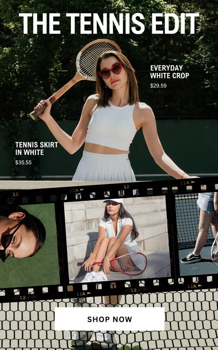
Image source: ca.pinterest.com
What are some high-converting email design examples?
High-converting designs include mobile-first responsive layouts that cater to the high volume of users on mobile devices. E-commerce showcases are also effective, using visual hierarchy to guide users toward a purchase. For B2B, clean templates that prioritize professional text over graphics often perform best.
What are the best email marketing platforms for small businesses looking to consolidate costs?
Small businesses should look for all-in-one platforms that combine email design with a full CRM and sales funnel builder. ASM CRM offers flexible pricing structures that remain accessible as your audience grows, making it a cost-effective alternative to platforms with per-subscriber fees. Consolidation reduces broken integrations and centralizes data.
Can I use an AI email campaign generator to handle both design and copy?
There are clinics that offer this type of AI-driven campaign generation, and modern systems are increasingly capable of streamlining these workflows. AI agents can further enhance this by qualifying leads who click on your designs and booking them into your calendar automatically. This ensures branding remains consistent across channels.
Which blast email software also includes a built-in CRM and funnel builder?
Most traditional blast software is limited to sending, but ASM CRM is a complete everything app that includes CRM, funnel builders, and a unified inbox. This integration allows for automated follow-ups based on specific design engagement, like clicking a link, ensuring a seamless checkout transition.