Visual Usability Checker: 5 Smart AI Design Wins
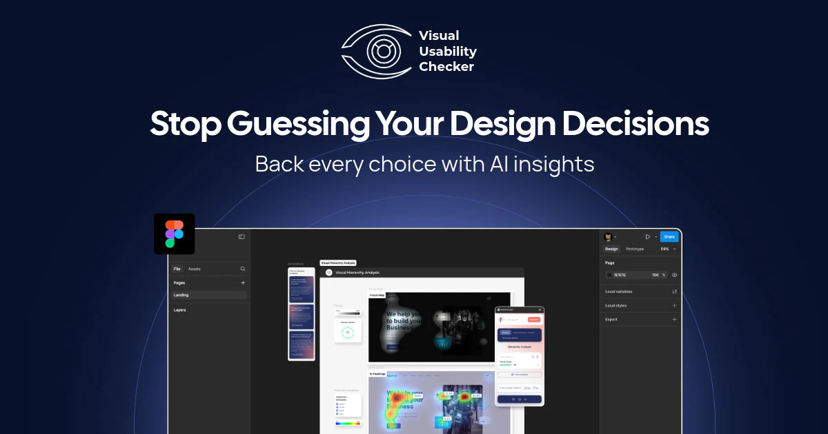
Visual Usability Checker by Attention Insight is an AI-powered design analysis tool that predicts cognitive load and attention heatmaps from static mockups.
Every design decision made without data is a gamble. When a stakeholder asks why the call-to-action button moved, or why the hero image changed, the honest answer is often “it felt right” — and that answer costs credibility, delays approvals, and sometimes costs tens of thousands of dollars in rushed user testing.
Traditional usability research runs anywhere from $5,000 to $50,000 per round, putting rigorous validation out of reach for most teams shipping at speed. Visual Usability Checker, the Product Hunt launch from Attention Insight that ranked #9 Product of the Day on May 21, 2026, proposes a different path: instant AI-powered design analysis that surfaces the insights before a single real user sees the screen.
Topics: Design Tools, User Experience, Artificial Intelligence
What Visual Usability Checker Does
At its core, Visual Usability Checker accepts design files or screenshots and returns a structured analysis of how users are predicted to interact with the visual layout. The tool does not require live traffic, a deployed product, or recruited participants. A designer uploads an image — a landing page mockup, an app screen, an email template — and within seconds receives a report covering attention distribution, cognitive load indicators, and potential usability friction points.
The product is built on top of the broader Attention Insight platform, which has been developing AI-driven visual attention prediction since before the current wave of generative AI tools entered the design space. That lineage matters: the underlying models are trained on eye-tracking study data, not synthetic outputs, which gives the predictions a grounding in actual human behavior.
For teams that need to present design rationale to non-designer stakeholders, the output format is particularly useful. Reports are shareable and visual, translating complex perceptual science into charts and heatmaps that product managers and executives can read without a UX background.
The AI and Machine Learning Behind Heatmap Prediction
The heatmap generation in Visual Usability Checker is not a filter or a rule-based overlay. It is a predictive model trained on aggregated eye-tracking data from human participants across thousands of study sessions. The model learns correlations between visual design properties — contrast ratios, spatial positioning, size hierarchies, motion cues — and where human eyes actually land during first exposure to an interface.
This approach, sometimes called saliency modeling or visual attention prediction, has a research history stretching back to computational neuroscience work from the late 1990s. Modern implementations layer deep learning architectures on top of that foundational research to improve accuracy across diverse design types: web interfaces, mobile screens, print layouts, and advertising creatives.
The practical implication is that the predictions are probabilistic, not deterministic. They represent what a statistically average user population is likely to notice first, not what any specific user will do. That distinction matters when communicating results to stakeholders: these are design risk indicators, not user test replacements.
Key Features
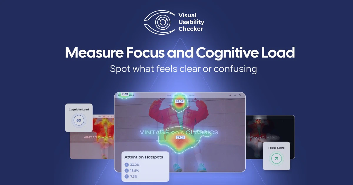
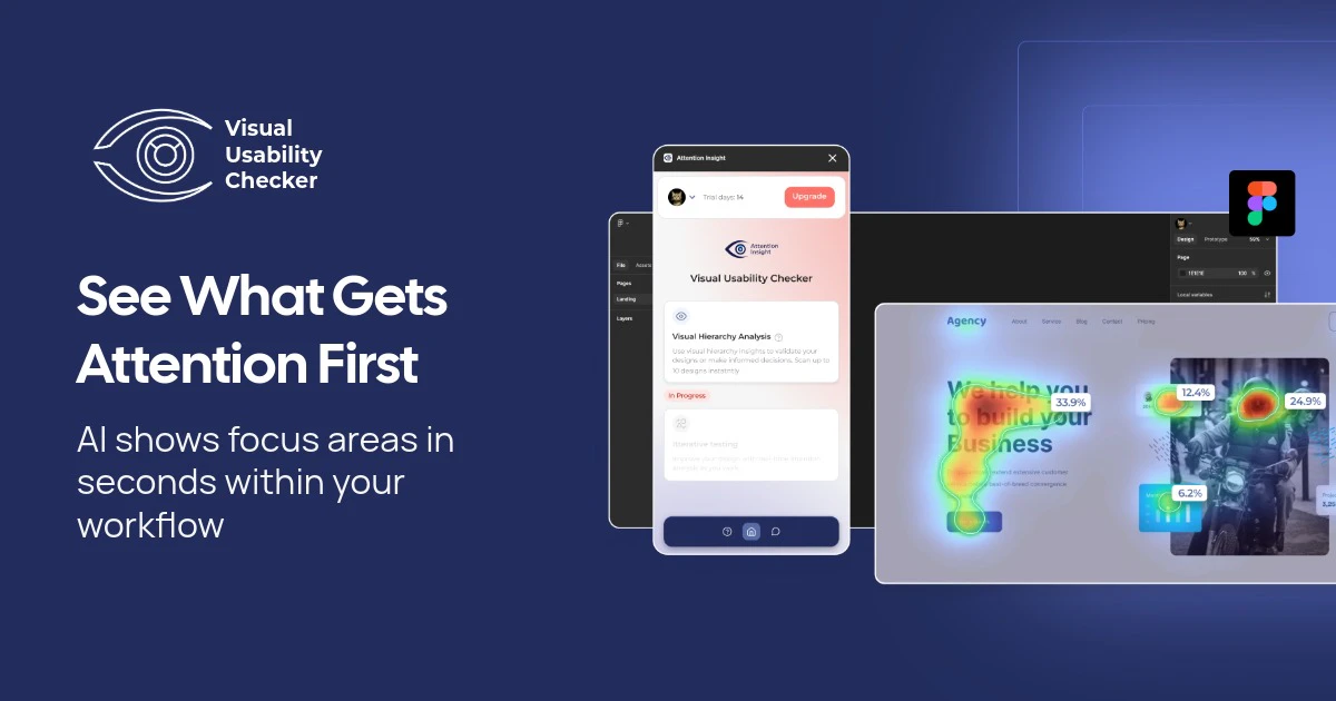
- Attention Heatmaps: Predicts where users will look within the first three to five seconds of viewing a design. The output is a color-gradient overlay ranging from cool (low attention) to warm (high attention), giving designers an immediate read on whether key elements are drawing focus or being missed.
- Cognitive Load Detection: Analyzes the visual complexity of a layout and flags regions where the density of competing elements may cause user fatigue or confusion. This feature is particularly relevant for form-heavy interfaces, dashboards, and e-commerce product pages where clutter directly correlates with drop-off.
- Variation Comparison: Allows side-by-side analysis of two or more design versions. Rather than running a full A/B test to determine which layout performs better, designers can use predicted attention data to make an informed hypothesis before committing to a live experiment.
- Focus Area Identification: Surfaces the specific elements that capture the highest predicted attention share, enabling designers to verify that visual hierarchy matches intended user journeys.
- Shareable Reports: Generates exportable analysis outputs suitable for design reviews, stakeholder presentations, and documentation inside design systems.
Pricing
Attention Insight offers tiered pricing that scales with usage volume. A free trial tier allows new users to run a limited number of analyses before committing to a paid plan. Paid plans are structured around the number of analyses per month, with team plans available for collaborative workflows. Exact pricing tiers are available on the Attention Insight website, and the cost of even a mid-tier monthly subscription represents a fraction of a single round of traditional usability testing.
Alternatives and Competitive Landscape
- Hotjar: Primarily a live-traffic heatmap and session recording tool. Hotjar requires a deployed product with real users to generate data, making it unsuitable for pre-launch design validation. It is complementary to, not a replacement for, predictive tools like Visual Usability Checker.
- Crazy Egg: Similar to Hotjar in that it depends on live traffic. Crazy Egg adds scroll mapping and A/B testing capabilities but cannot predict attention on static mockups.
- EyeQuant: A direct competitor in the AI attention prediction space. EyeQuant has a longer enterprise track record and is used by large agencies and brand teams. It is generally positioned at higher price points and larger organization budgets.
- Neurons: Another AI-powered attention and cognitive analysis platform, Neurons has expanded into broader consumer neuroscience research services. Like EyeQuant, it targets enterprise clients. Visual Usability Checker appears positioned to serve mid-market design teams and independent practitioners.
Teams looking for a broader editorial perspective on AI-powered product tools can find ongoing coverage at Automated Sales Machine.
Who Should Use It
- UX designers and UI designers who need to validate layout decisions before handing off to development and want documentation to support design reviews.
- Product managers who are accountable for conversion metrics and need to make defensible prioritization calls about design changes without waiting for A/B test results.
- Marketing and growth teams running landing page experiments who want to pre-screen design variations before committing paid traffic to a test.
- Design agencies and consultants who need to present evidence-based recommendations to clients.
- Startups in pre-launch phases where there is no live traffic to analyze but design quality directly affects first-impression conversion rates.
Pros and Cons
- Pro: No live traffic required — works on static mockups and screenshots at any stage of the design process.
- Pro: Predictions are grounded in real eye-tracking data, not synthetic rules.
- Pro: Variation comparison reduces reliance on expensive or slow A/B testing for design hypothesis validation.
- Pro: Shareable report format is accessible to non-technical stakeholders.
- Con: Predictive models represent population-level tendencies and may not accurately reflect niche or specialized user audiences with distinct scanning behaviors.
- Con: Does not replace live usability testing for identifying task completion failures, error states, or accessibility barriers that require real user interaction.
- Con: Pricing structure may present friction for individual freelancers running low analysis volumes.
Verdict
Visual Usability Checker addresses a real and persistent problem in design workflows: the gap between intuition-driven decisions and evidence-backed ones.
For teams that cannot afford $10,000 usability studies every sprint cycle, AI attention prediction offers a practical middle ground — not a replacement for user research, but a meaningful signal layer that raises the quality of design decisions before they reach production. The tool’s strength is its focus. It does one thing — predicts where users will look and flags where designs may be working against user goals — and it does it quickly. The #9 Product of the Day ranking with 129 votes on launch day suggests the practitioner community shares that assessment.